What we do
We help companies sell more by designing packaging that stops shoppers, explains the product in seconds and scales across every flavor, size and format. From one new SKU to a full product line, every design is built for the shelf and ready for production.
Packaging is our focus, but it isn’t all we bring. The studio is built on decades of brand and concept development, so when a package needs a sharper story, a refreshed identity or a brand built from the ground up, we can take it there too.
01 — Selected work
Every project starts with one question: what does a shopper see in the three seconds they give your aisle? Here is how we have answered it.
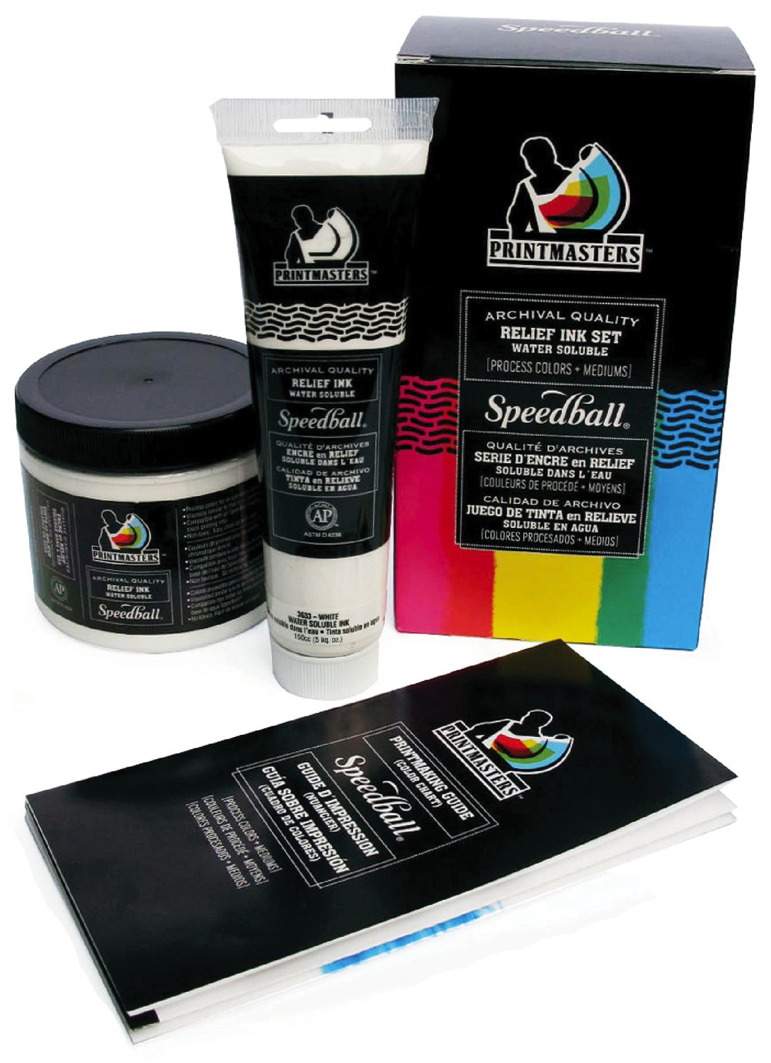
Speedball · Printmaking inks
Ink that looks like art before the lid comes off. A bold printmaker mark and process-color brush strokes tie the set box, tubes, jars and guide into one studio-ready family, in three languages.
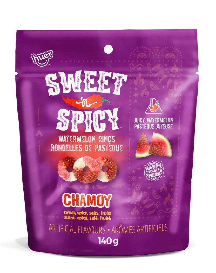
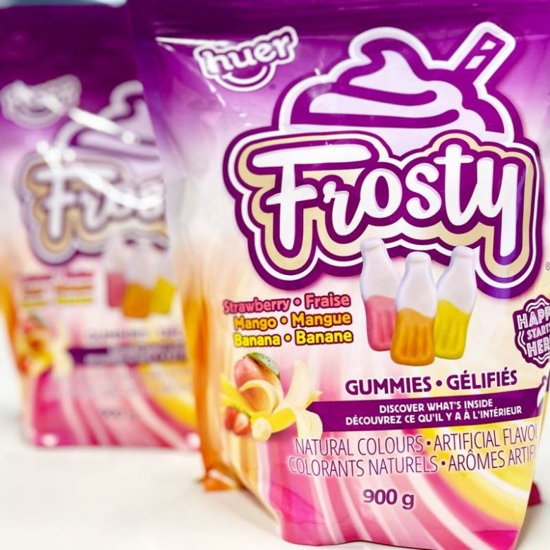
Huer · Gummies
Sweet up front, heat on the finish. Chamoy-inspired color and graphics that taste spicy from across the aisle.
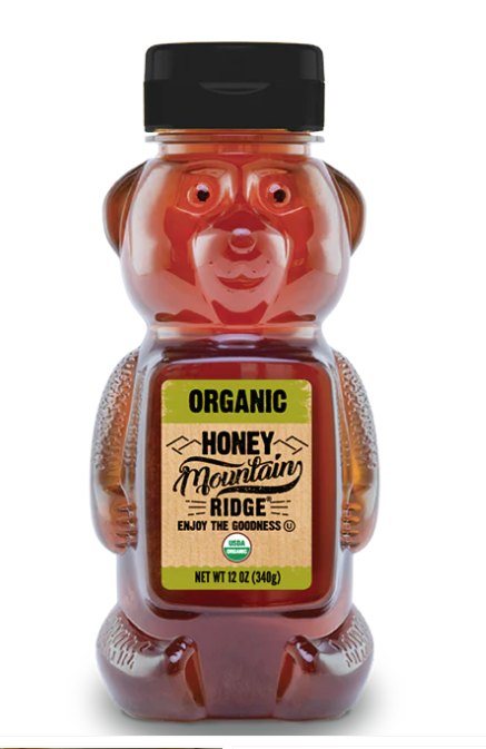
Honey · Organic
Same honey, new silhouette. The label system squeezed perfectly onto the iconic bear.
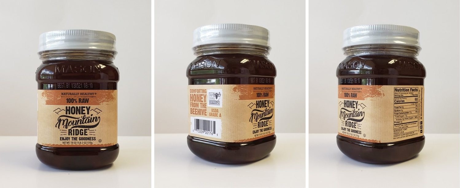
Honey · Wraparound label
A label that rewards a turn of the jar: brand front and center, claims on the side, the fine print neatly tucked around back.
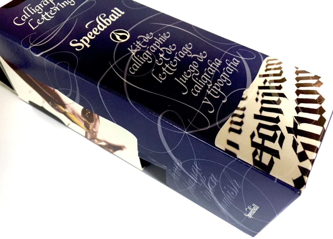
Speedball · Craft kits
The lesson starts on the box. Flourished script and blackletter samples show buyers exactly what they will learn to create, in three languages.
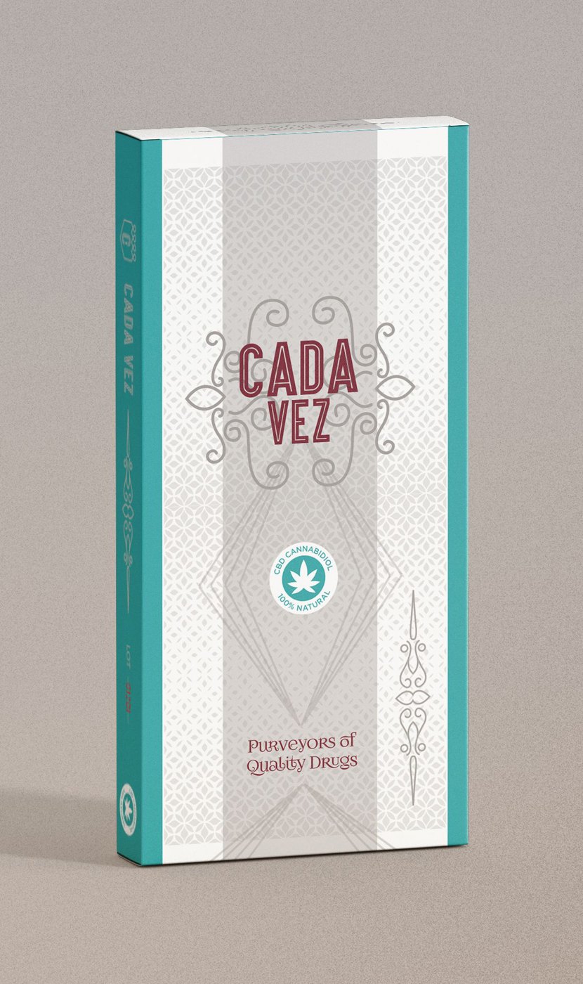
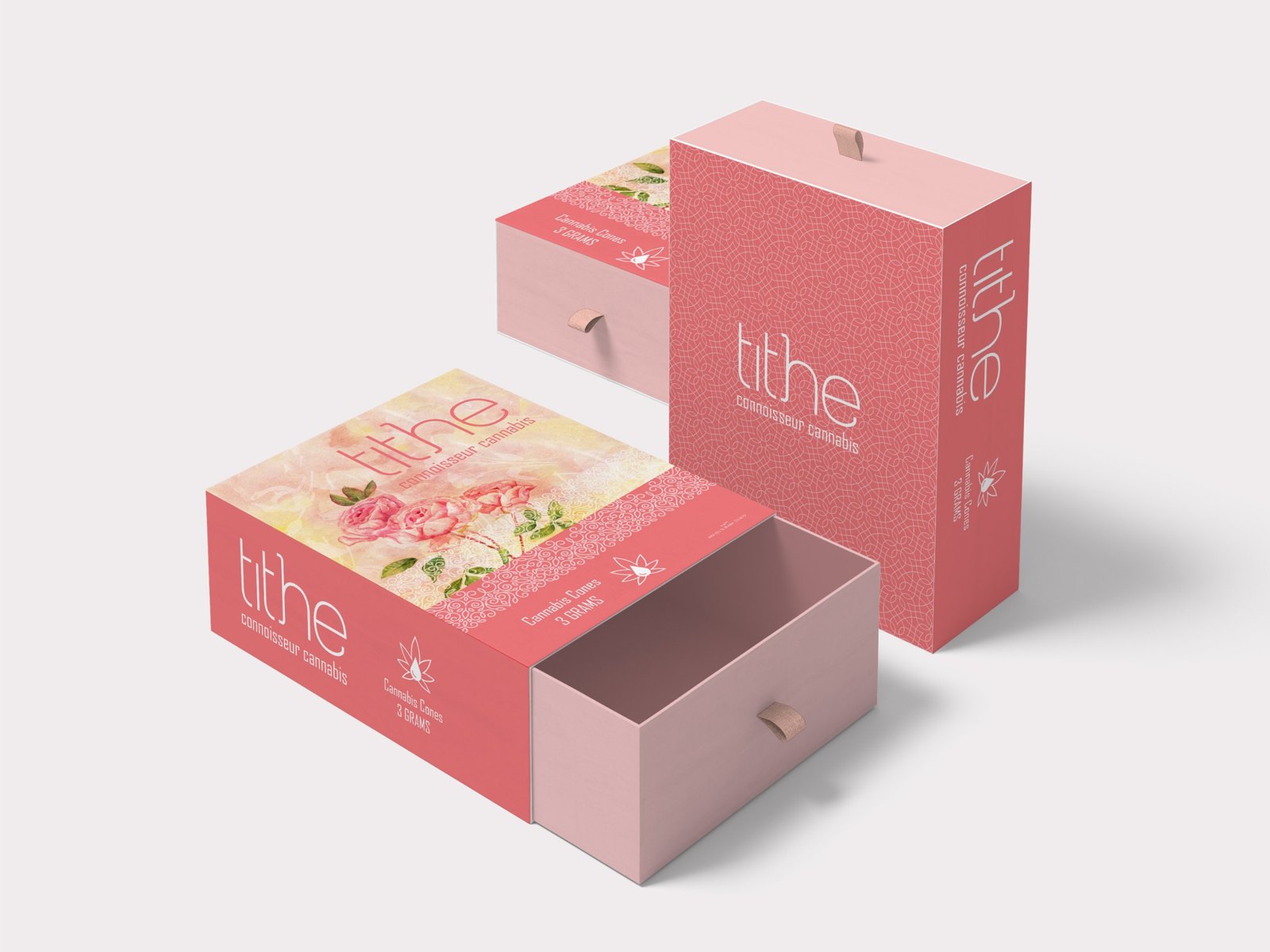
Cannabis · Premium carton
Watercolor florals and fine linework on a slide-drawer box, made to be opened slowly by people who notice details.
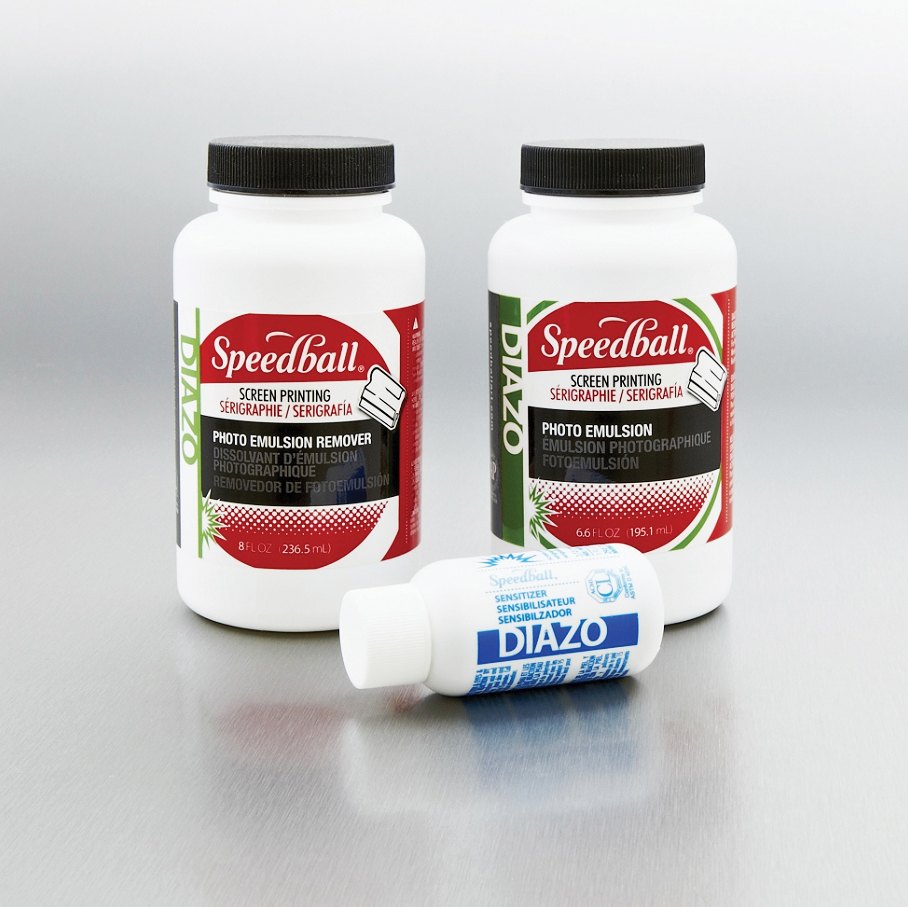
Speedball · Screen printing
Lab-grade chemistry with studio attitude. A bold red Speedball badge, halftone burst and color-coded Diazo band keep emulsion, remover and sensitizer instantly paired, in three languages.
02 — Line versions
National brands rarely launch a single SKU. These systems flex across flavors, sizes and formats, so each variety stands apart and the whole range reads as one brand.
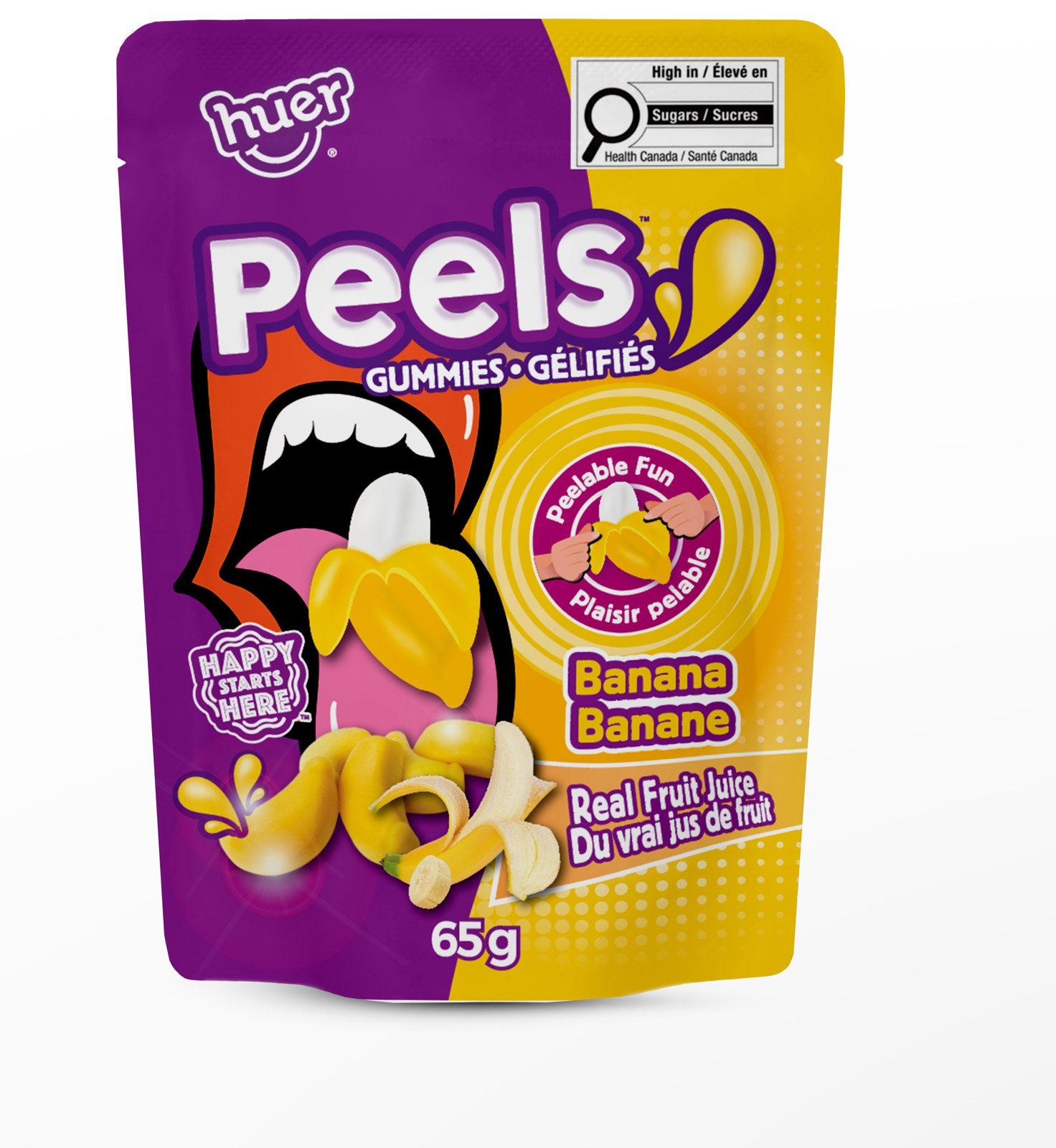
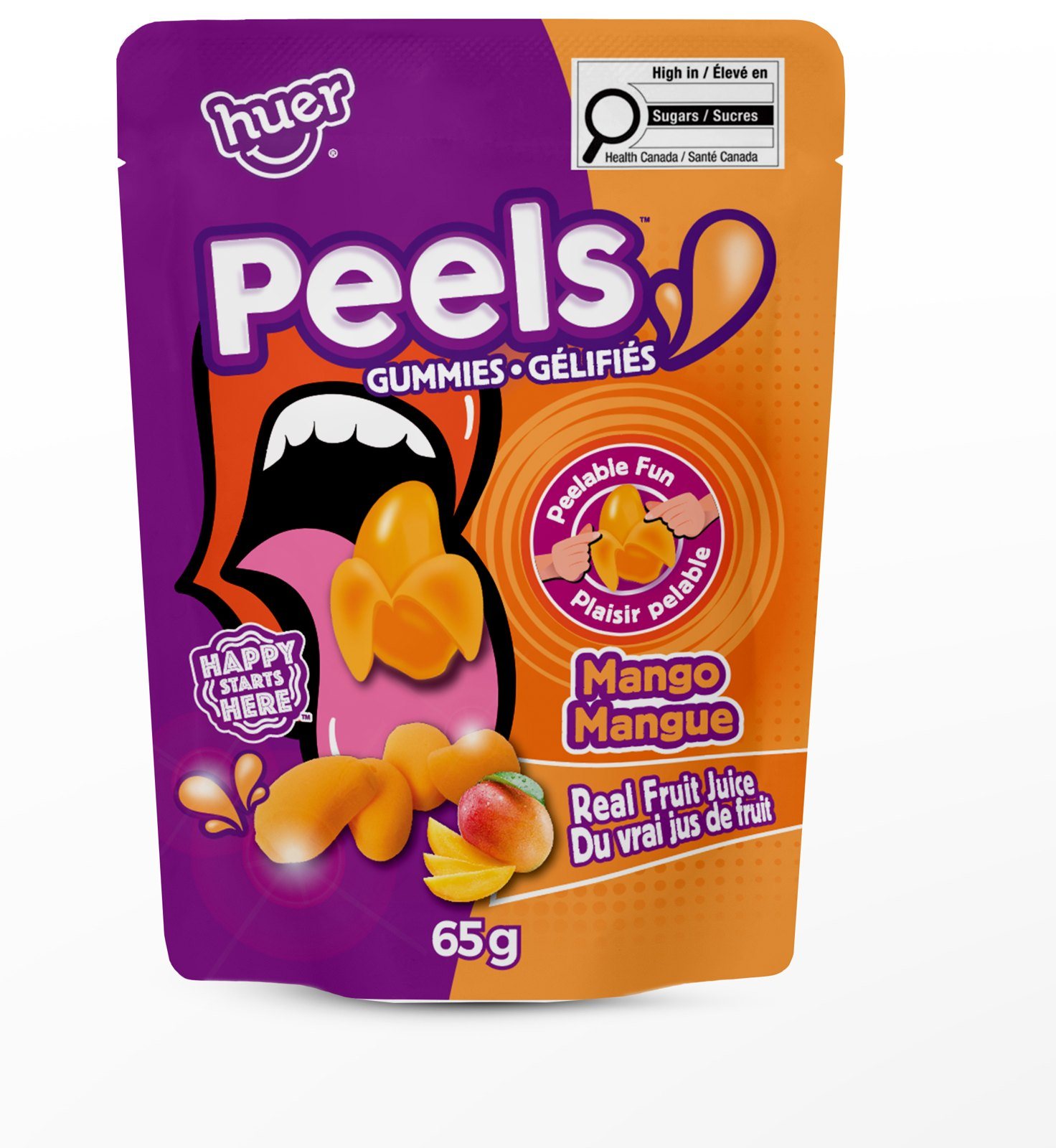
Huer · Gummies · 2 varieties
A pop-art mouth, a split-color pouch and a gummy you peel. The color field switches with every fruit, so the fun never repeats twice.
Banana · Mango
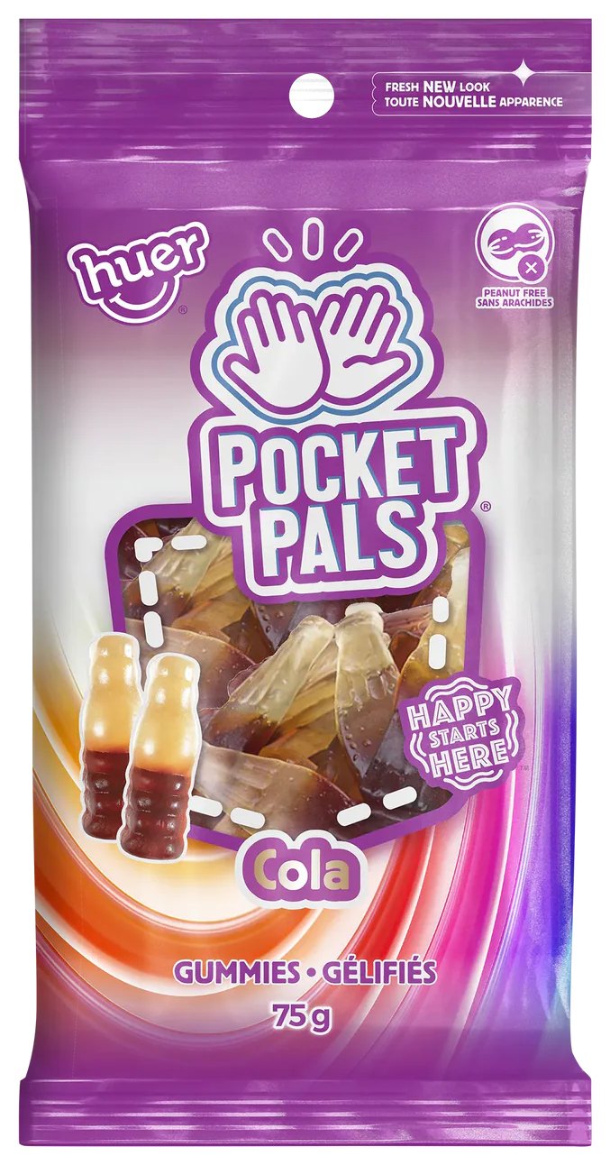
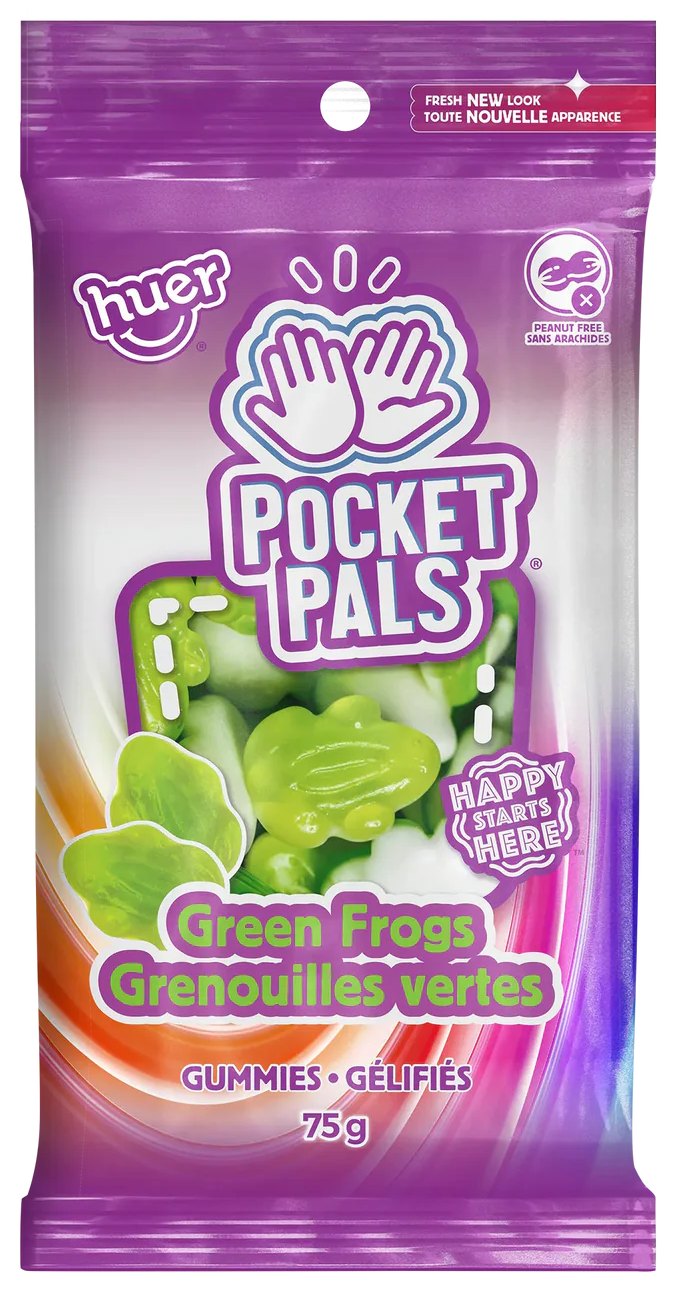
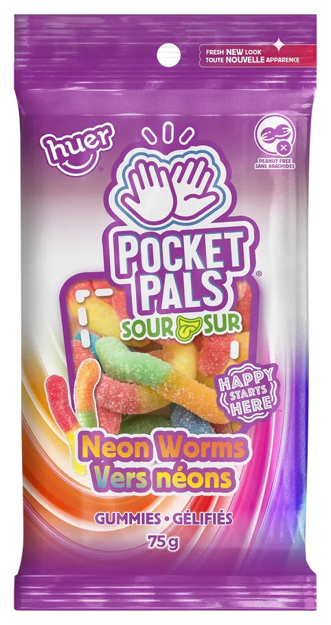
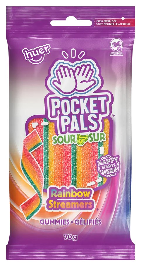
Huer · Gummies · 4 varieties
Small bag, big high-five. A die-cut window and a color swirl that shifts with each gummy turn a peg wall into one bright family.
Cola · Green Frogs · Neon Worms (Sour) · Rainbow Streamers (Sour)
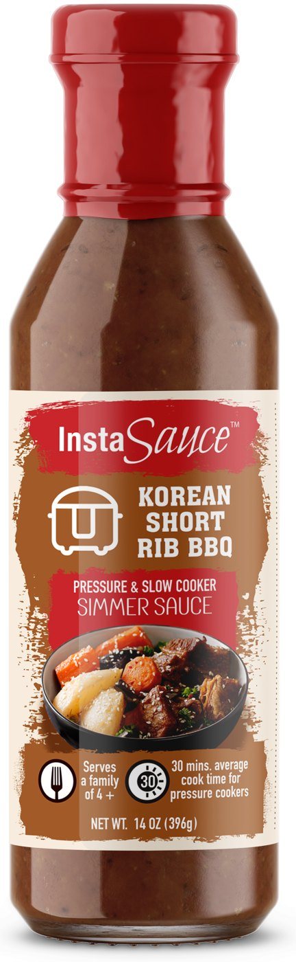
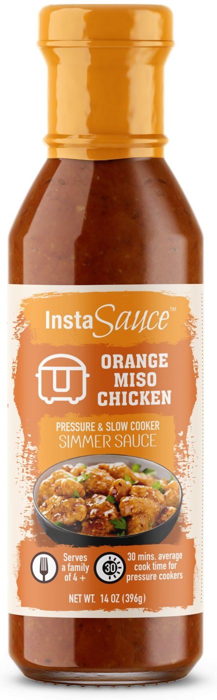
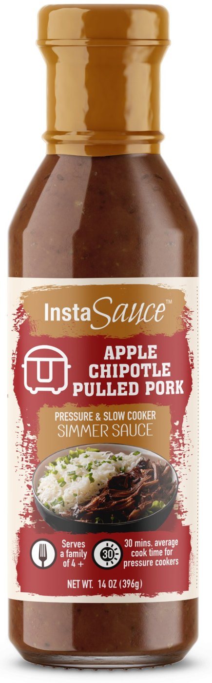
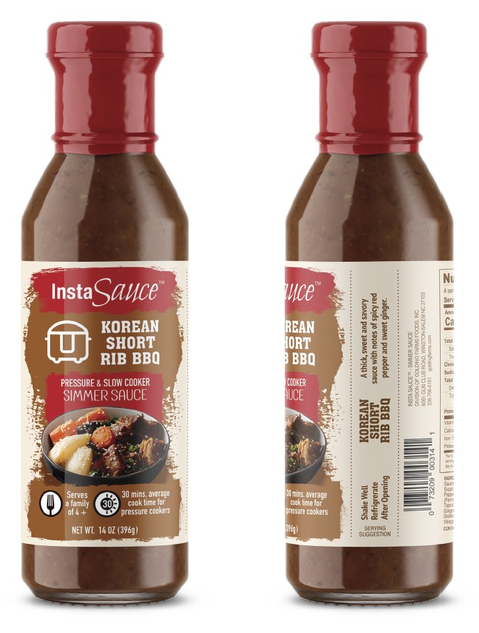
Pressure & slow cooker sauces · 4 varieties
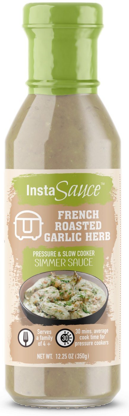
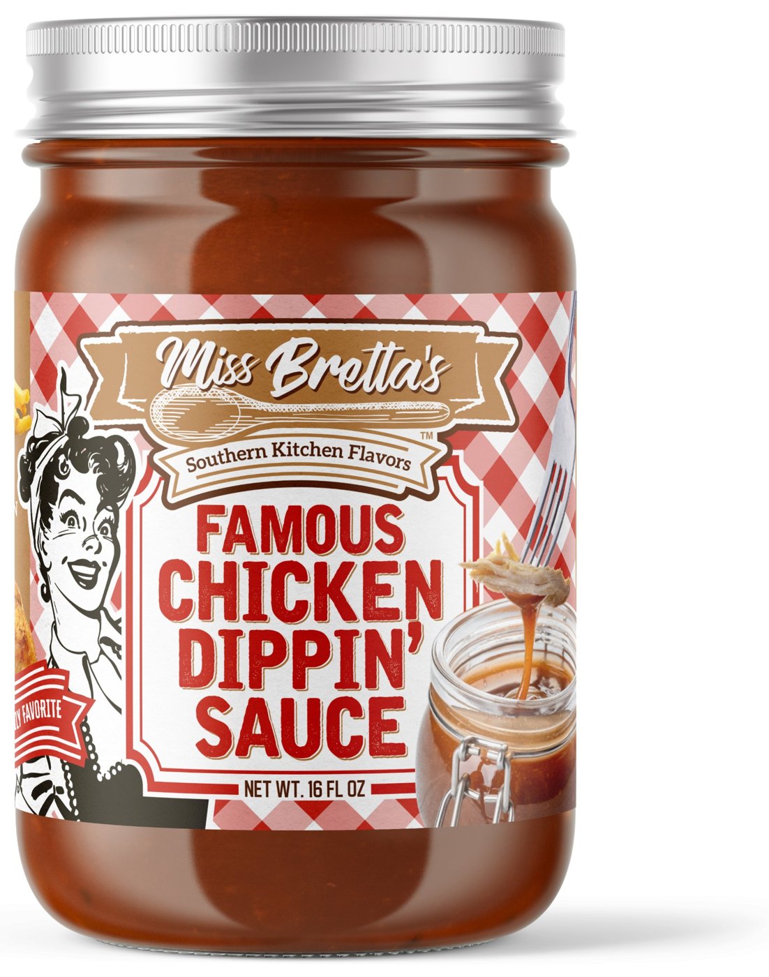
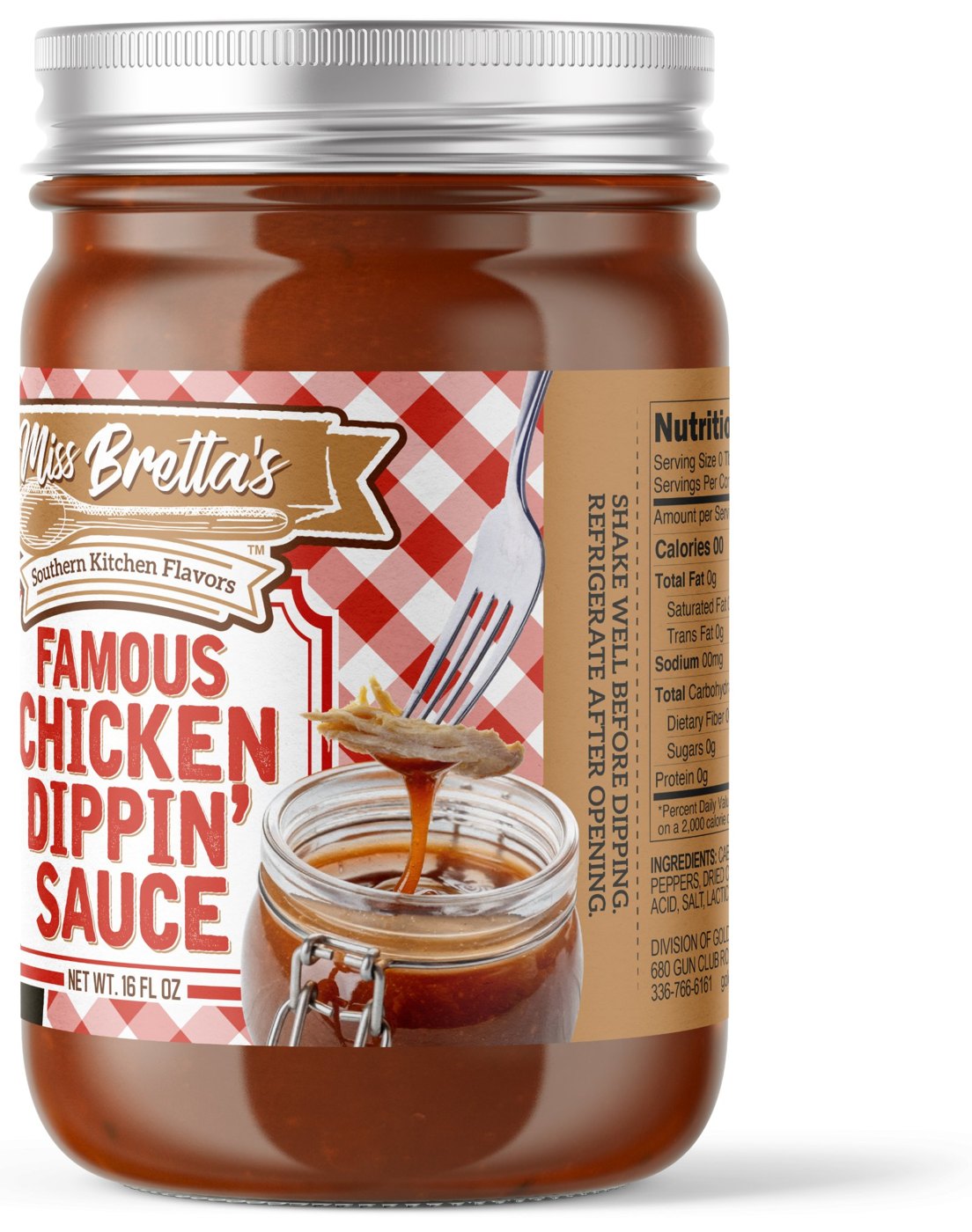
Dinner, decoded by color. Each recipe gets its own cap, band and hero dish, so shoppers find their flavor in a glance.
Korean Short Rib BBQ · Orange Miso Chicken · Apple Chipotle Pulled Pork · French Roasted Garlic Herb
Huer · Better-for-you · 2 varieties
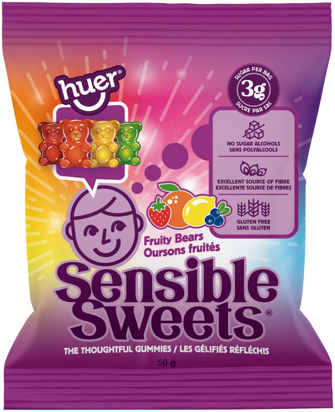
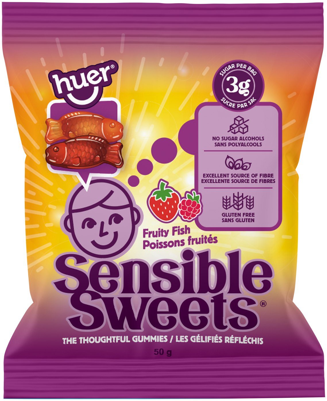
Same friendly character, new glow for every variety. The claims panel and lockup stay put while the gummy shape does the talking.
Fruity Bears · Fruity Fish
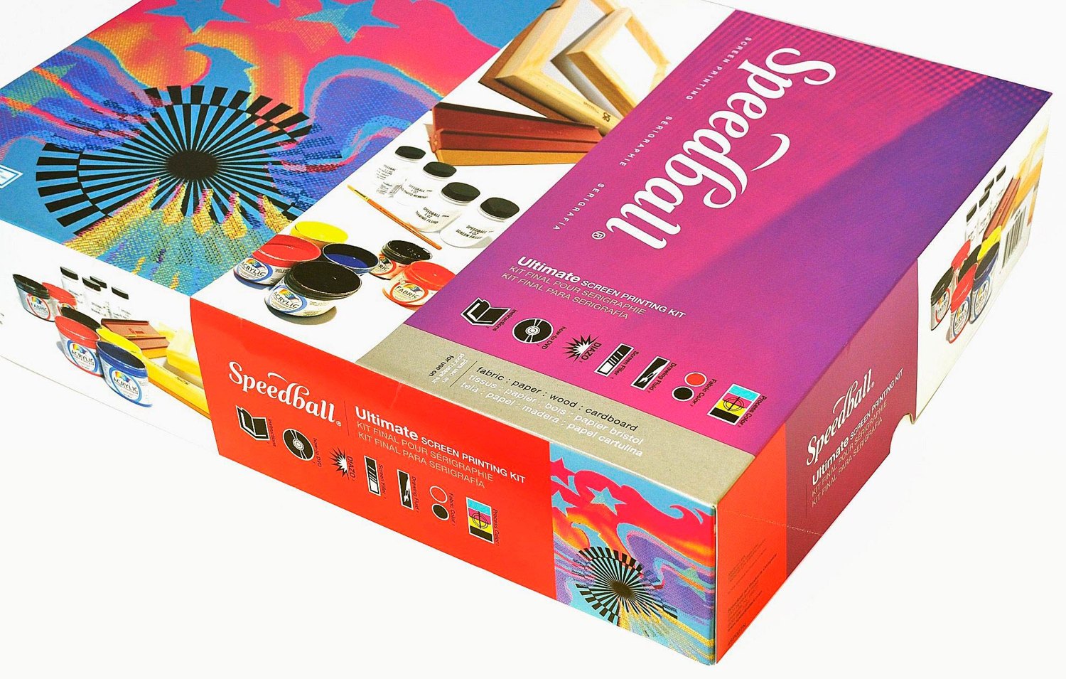
Speedball · Craft kits · 2 varieties
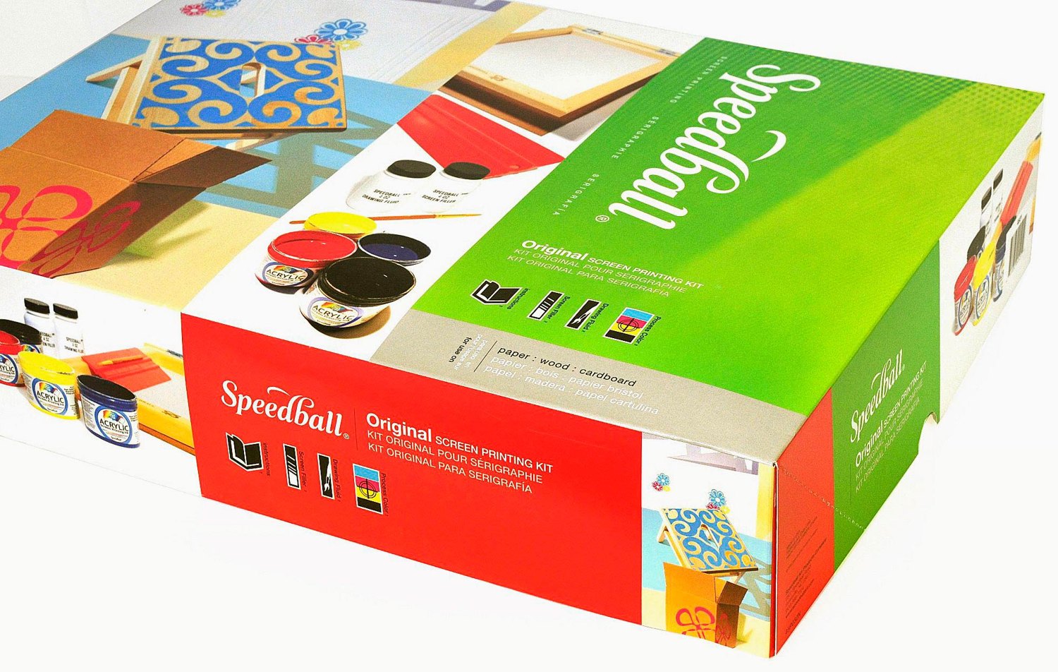
From first pull to pro setup. A red brand band and icon row hold the line while hero color and artwork level up with each kit.
Original Screen Printing Kit · Ultimate Screen Printing Kit
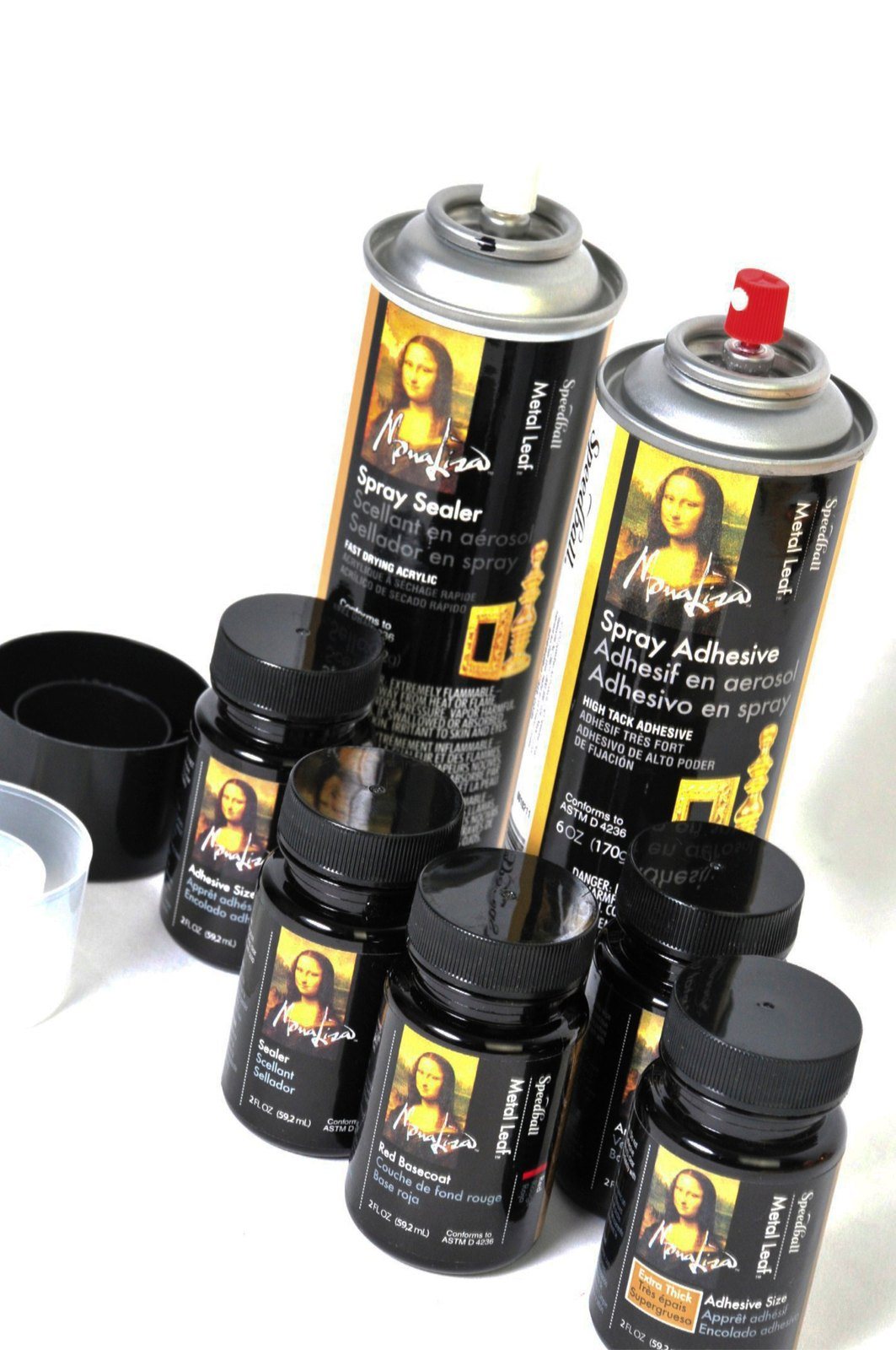
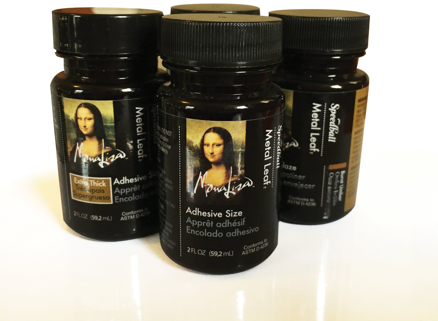
Speedball · Art supplies · 5 varieties
Gilded from label to lid. A gallery-gold system across aerosols and bottles, with a color tab marking each step of the gilding process.
Spray Sealer · Spray Adhesive · Adhesive Size · Red Basecoat · Antiquing Glaze
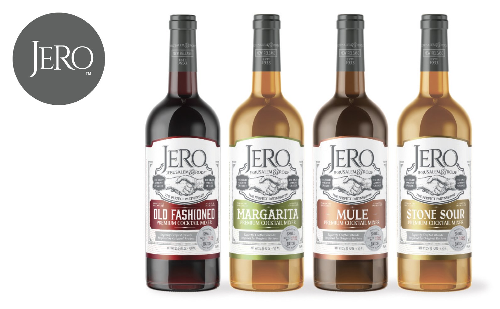
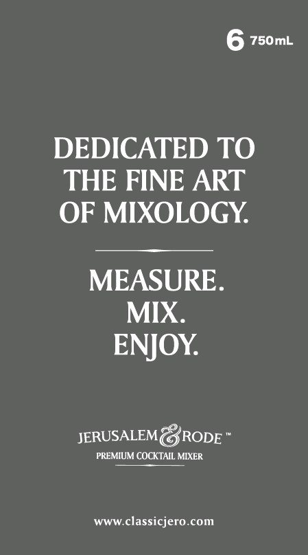
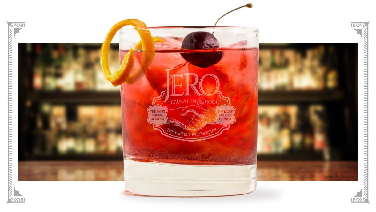
Jerusalem & Rode · Mixers · 4 varieties
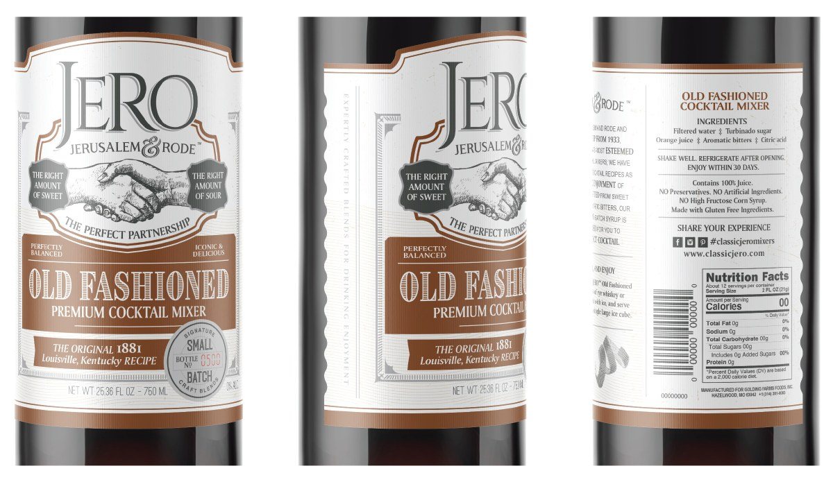
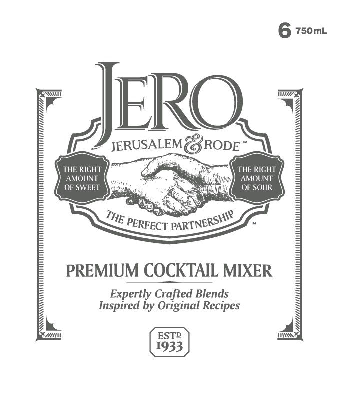
Old-world engraving, modern bar cart. One label layout across four recipes, with a color band that calls out each mixer from across the room.
Old Fashioned · Margarita · Mule · Stone Sour
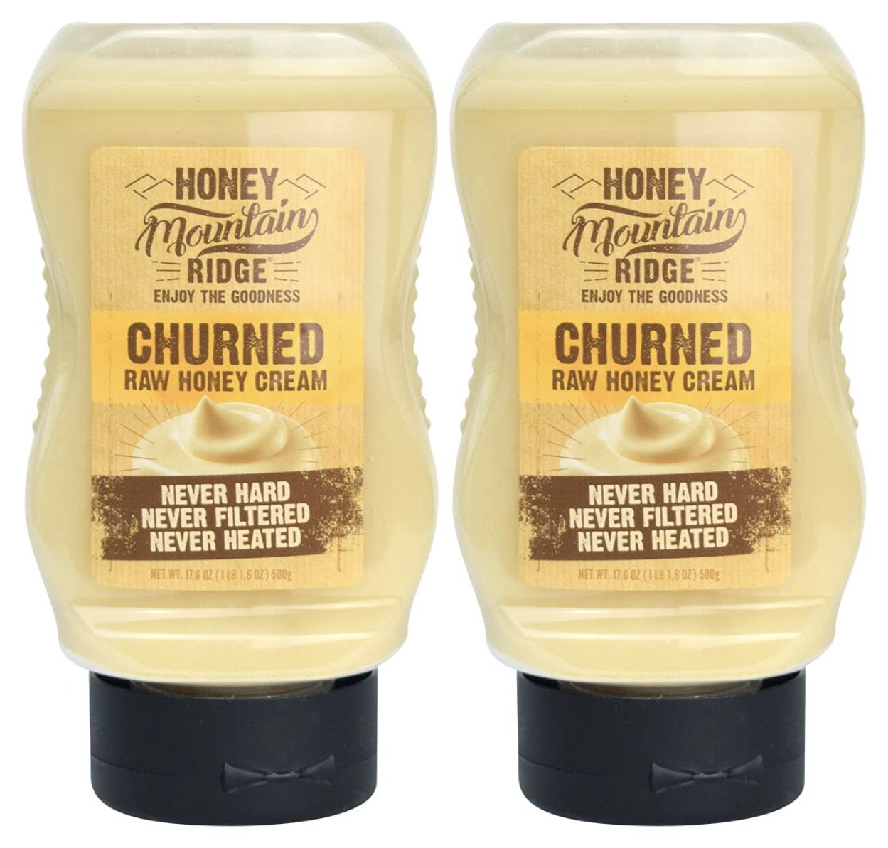
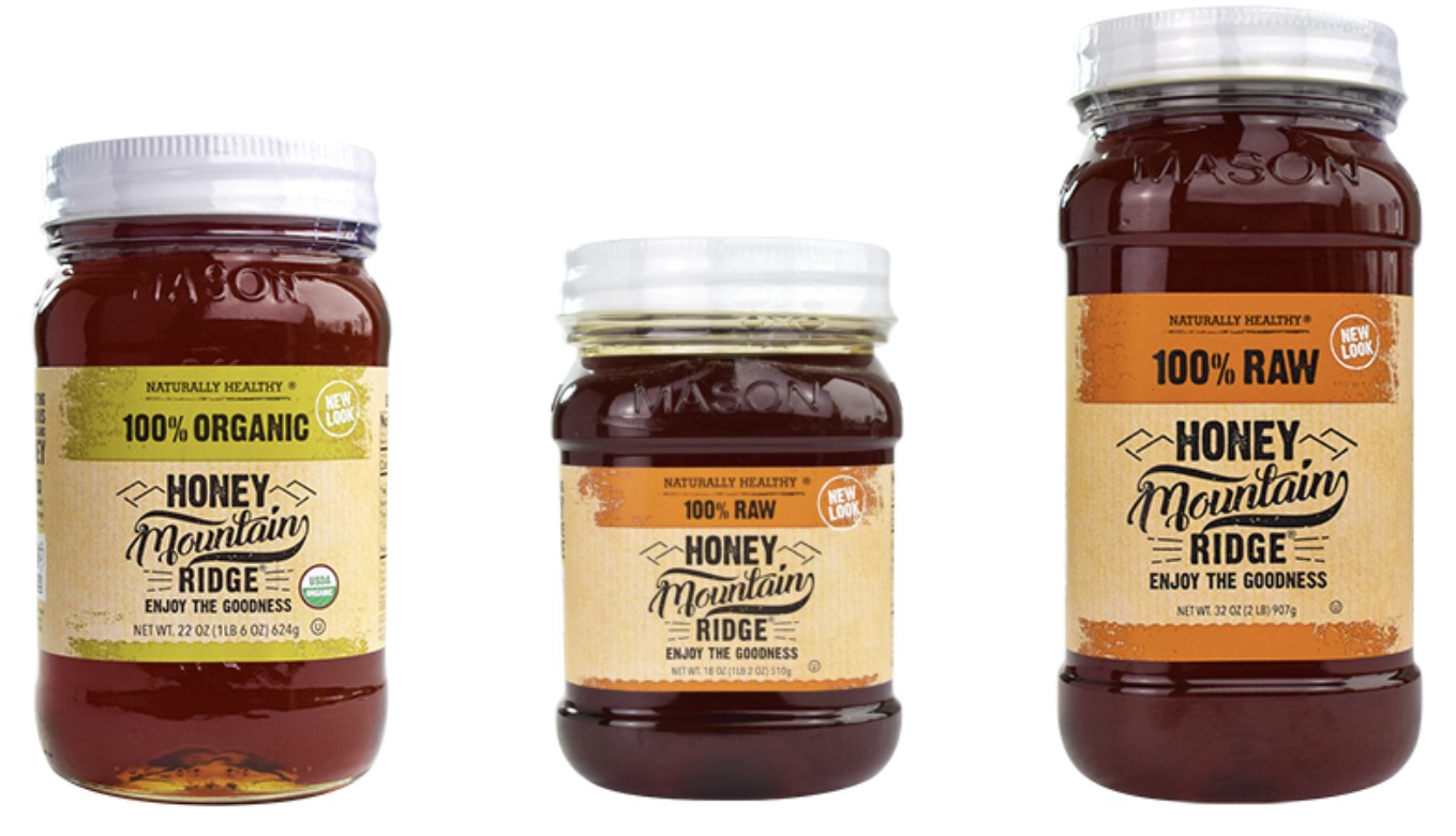
Honey · Raw, organic & churned · 3 varieties
Hand-lettered and honest. A rustic label family with a color-coded band for each variety, from 100% Organic to 100% Raw, sized up from 18 oz to 32 oz jars.
100% Organic · 100% Raw
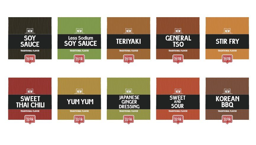
Asian sauces & dressings · 10 varieties
One chef, ten sauces. A bold black band and badge anchor the system while a woodgrain color field changes for every flavor.
Soy Sauce · Less Sodium Soy · Teriyaki · General Tso · Stir Fry · Sweet Thai Chili · Yum Yum · Japanese Ginger · Sweet & Sour · Korean BBQ
Send the brief. You’ll hear back from the studio directly, with a clear, fixed quote.
03 — Up close
The front sells, but the whole package works: side and back panels, full label wraps, shipper cartons and the brand in use.
Heritage engraving, a numbered small-batch seal, and back-panel copy and nutrition laid out to the same grid.
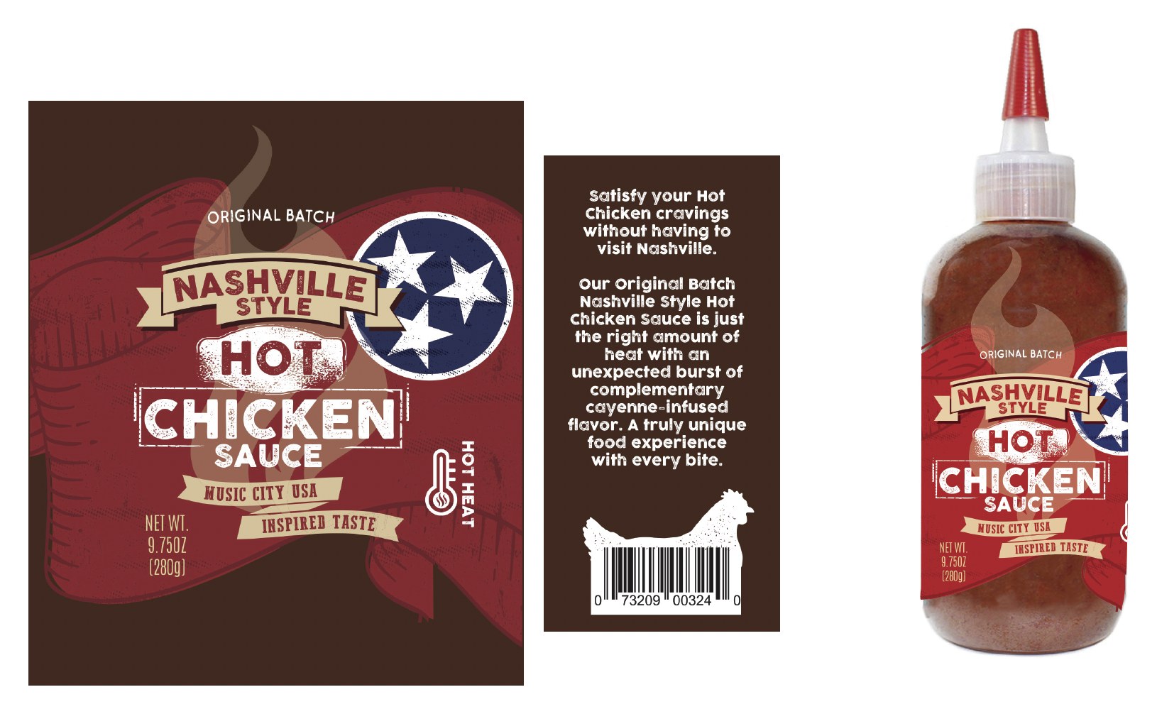
Distressed type, ribbon banners and the Tennessee star, carried from the flat label to the back-panel story and the finished squeeze bottle.
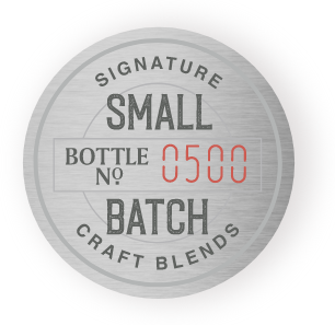
A numbered, brushed-metal seal that marks every bottle as a signature craft blend.
A warm, hand-drawn wordmark built to hold up on a jar lid, a shelf tag or a farmers-market banner.
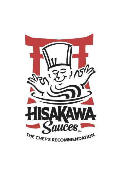
Hand-lettered wordmark on a red brushstroke, locked up with “The Chef’s Recommendation.”
04 — Why us
You get the full range of professional services — brand strategy, concepts, identity, structural design, production-ready files — from senior designers who stay on your project from start to finish. Packaging is what we do every day, but the thinking behind it comes from years of building whole brands, so your pack is grounded in more than good looks. A lean studio means fewer layers, faster decisions and more of your budget going into the work itself.
Large agency
National Package Design™
Who designs your pack
Senior team pitches, junior team executes
Senior designer from first sketch to final file
Who you talk to
Account managers and project managers
The person doing the work
Where your budget goes
Shared across overhead and management layers
Goes into the design itself
How projects are quoted
Retainers and open-ended hours
Clear, fixed project quotes
Free packaging review
Share a link or a photo of your product and I will give you a call to talk through what is working on shelf, what could work harder, and whether there is an opportunity to help. No cost and no obligation.
05 — Services
When the package needs more than a new look: brand story, positioning, identity and concept development, drawn from decades of full-brand work.
Scalable architecture across flavors, sizes and SKUs, so the whole line reads as one brand.
Modernize an established pack without losing the equity loyal shoppers look for.
Dielines, mechanicals and printer-ready art, prepared to spec and ready for your vendors.
06 — How it works
Your brand, your competitors, your shelf — and what has to change.
Distinct creative directions, shown in context, not in a vacuum.
One direction, sharpened across every SKU and format you need.
Final art and files, ready for print and on schedule for launch.
What clients say
“Dennis is incredibly creative, with a sharp eye for detail that ensured every element of the design process aligned with our vision and strategy… If you’re looking for a designer who combines strategic thinking with exceptional creativity, Dennis is the person you want on your team!”
Head of Marketing · Full strategic redesign of a candy brand
“Dennis is one of the most strategic creatives I know. Before he starts thinking visually, he always wants to understand the true objectives of the project and that informs his creativity… I recommend him to anyone looking for a creative edge.”
Founder & CEO, Birchline Advisors
“Dennis brings real-world wisdom to creative assignments so both the experience and outcomes stand out from the rest.”
Partner & Creative Director
07 — Start a project
Tell us about your brand and your timeline, and you will get a clear, fixed quote for the project. We reply within one business day.
Based in Winston-Salem and Charlotte, NC · Working with brands nationwide